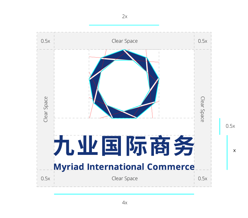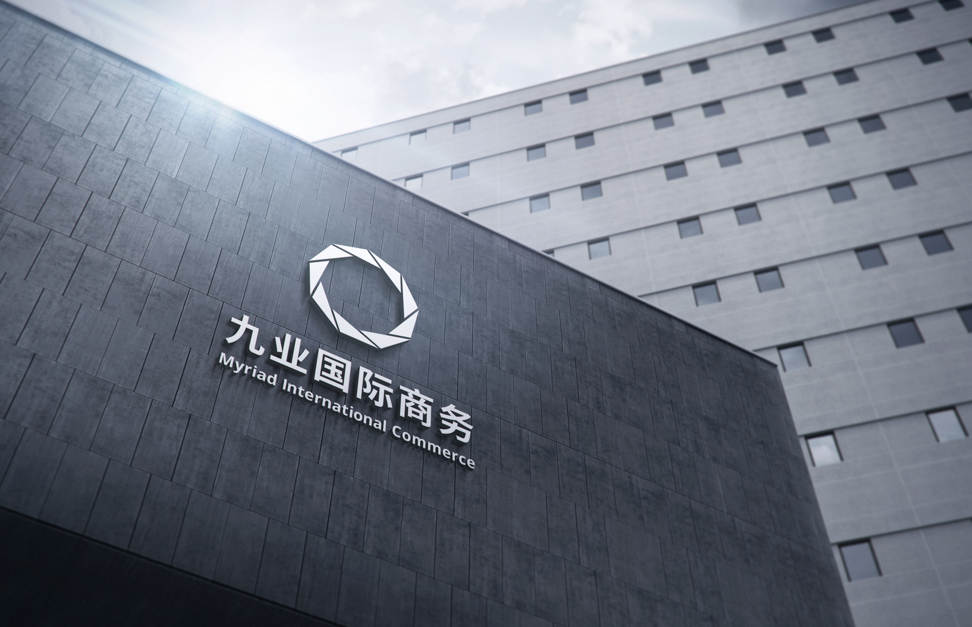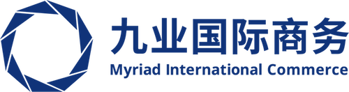
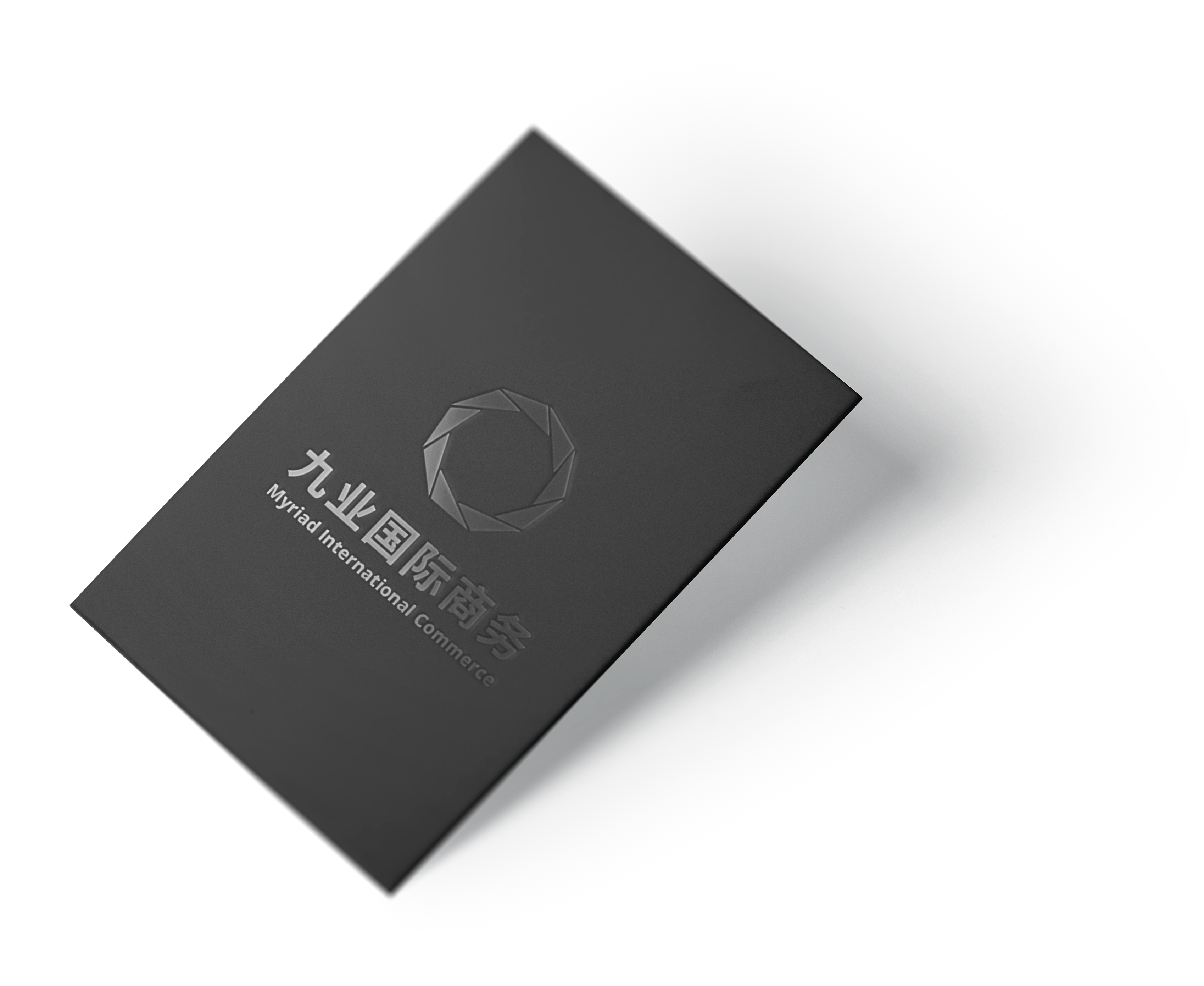
Myriad is a Chinese international commerce company based in Shanghai and founded in 2017. The company's goal is becoming a clients' dependable business partner and growing together in the infinite future.
The Chinese name "九业" means “nine industries” by literally translated, but in the deep meaning "nine" means "max" or "infinite." Therefore, we call the company "Myriad" in English.
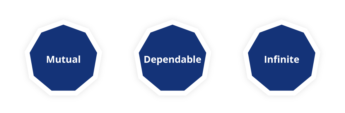
We distilled the three keywords from the brand's goal and the brand's name and created the logo for the keywords.
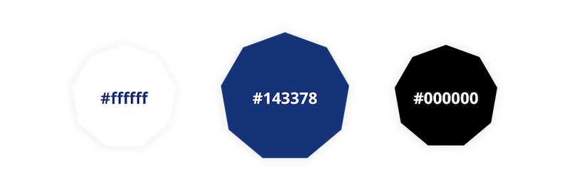
The brand main color is dark blue so that the audience could taste Myriad is a professional and dependable commerce company.