The purpose of redesigning this website is to eliminate all of the pain points which inhibit the users from effectively navigating to find information. The site has an illogical structure with a poor user flow for its audience. Instead, I have created a new, streamlined structure for the AAU Website, providing users with a truly straightforward, seamless, and enjoyable experience.
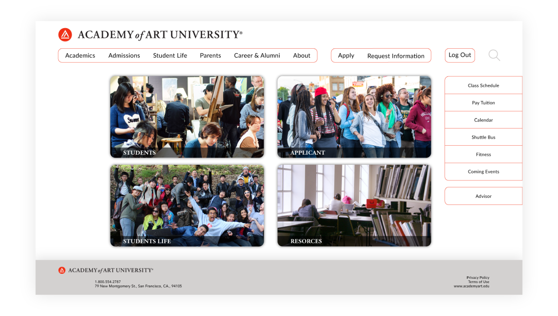
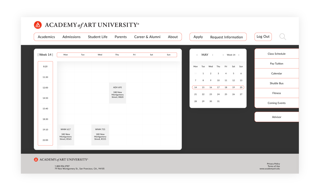
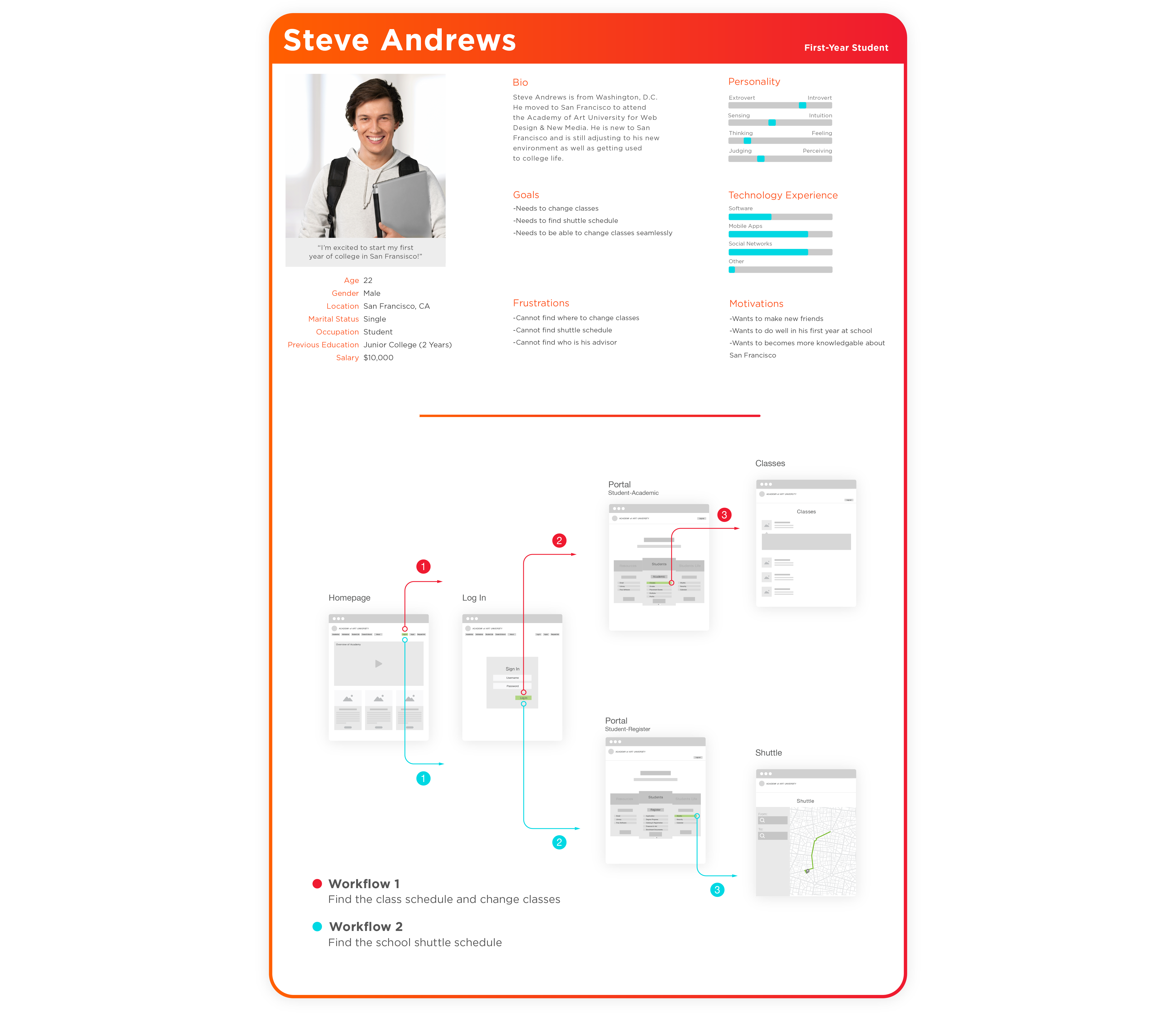
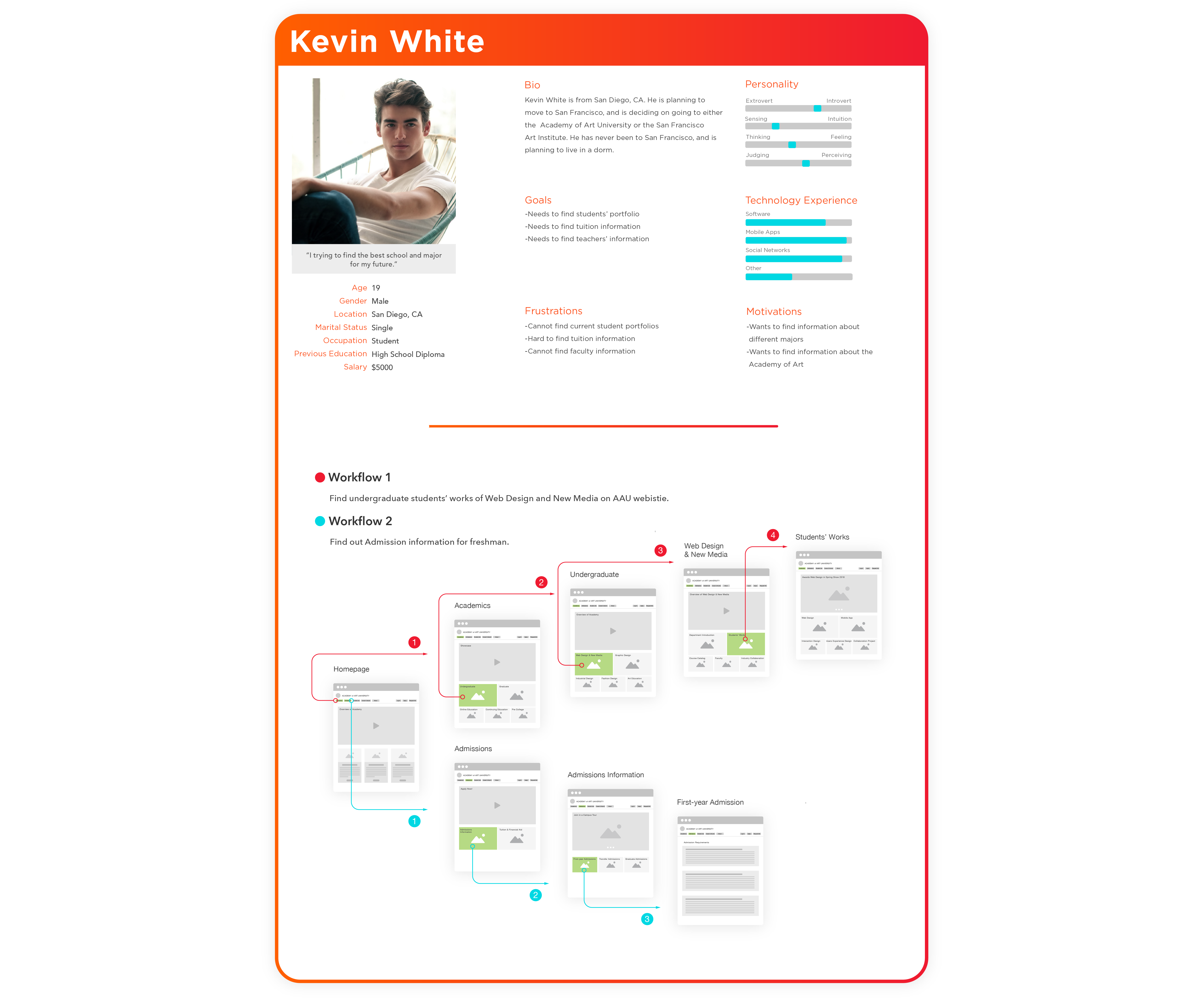
The cards show the three target audience of the AAU website; they have the different demand for using the site. For example, Steve wants to know the shuttle bus schedule, because he is a new student at AAU.

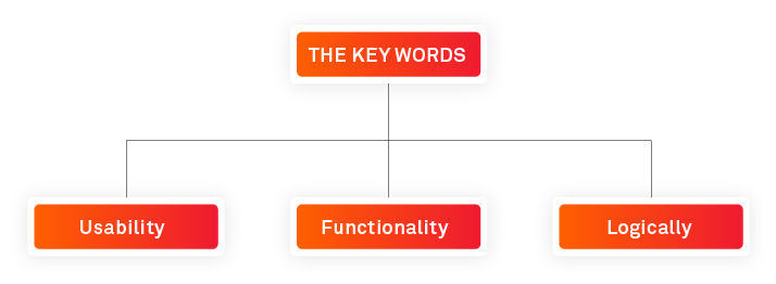
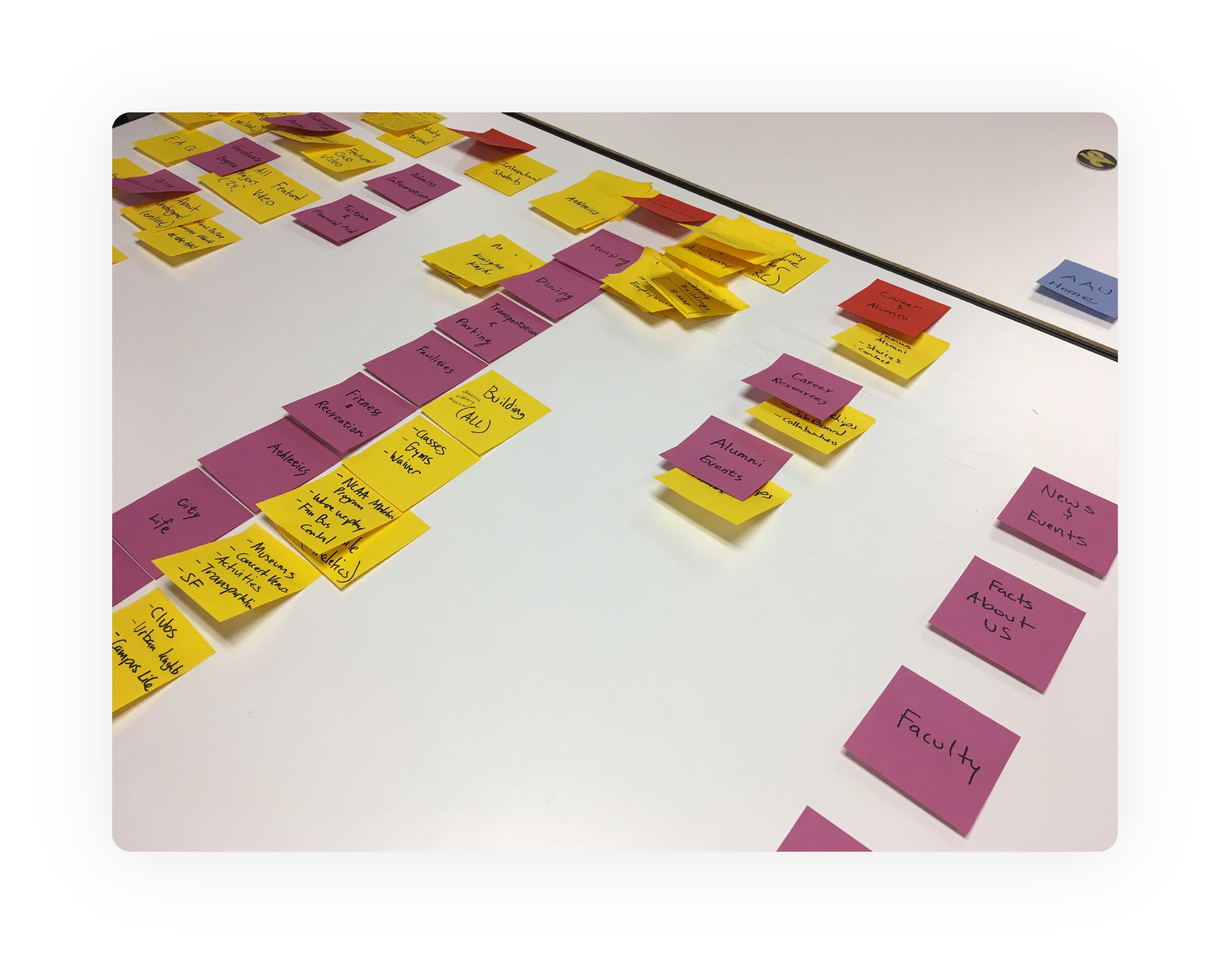
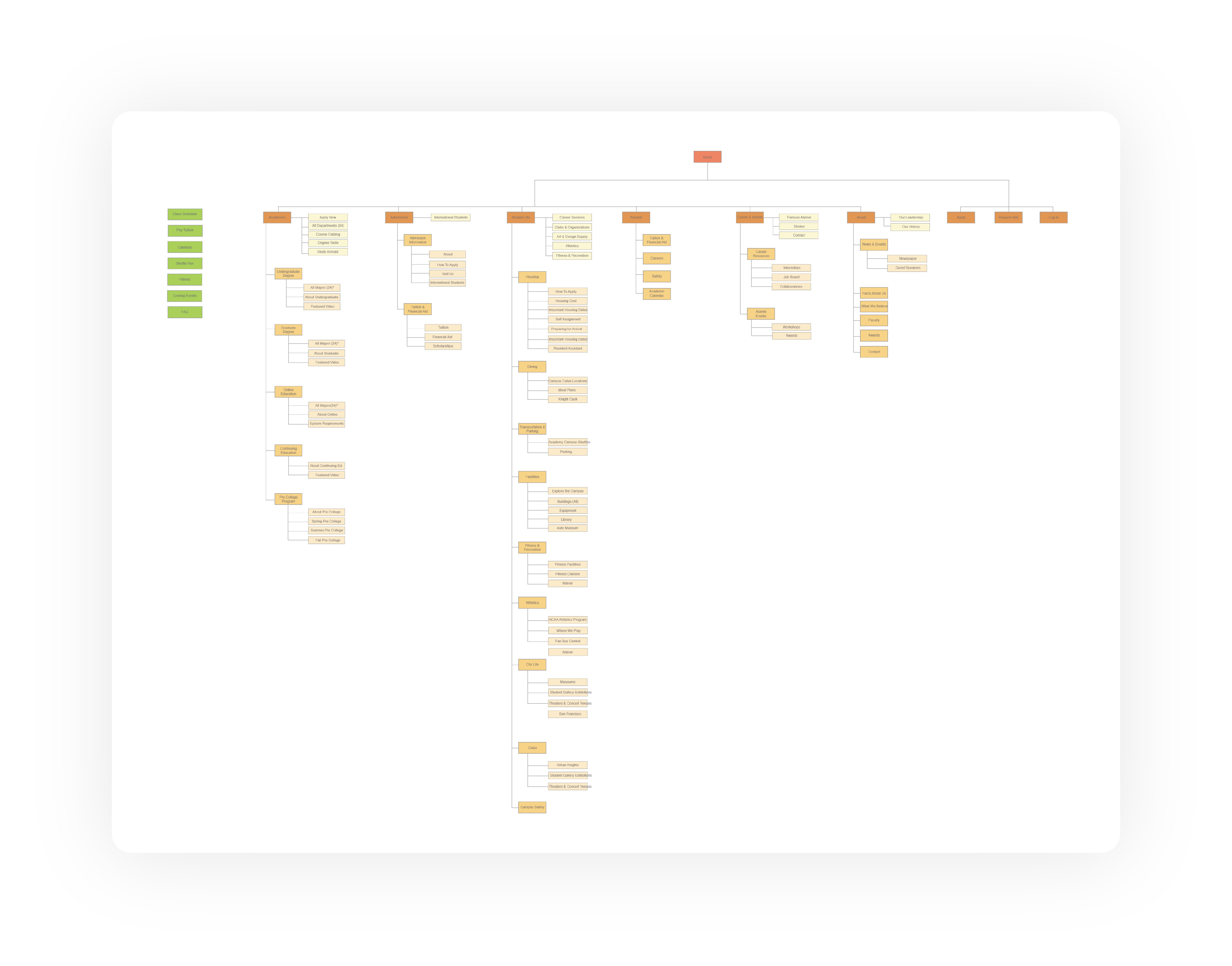
Clear and logical flow is the main goal in this redesign with the sitemap as the most important process for the site. Three types of target audiences can easily and effortlessly find their pages.
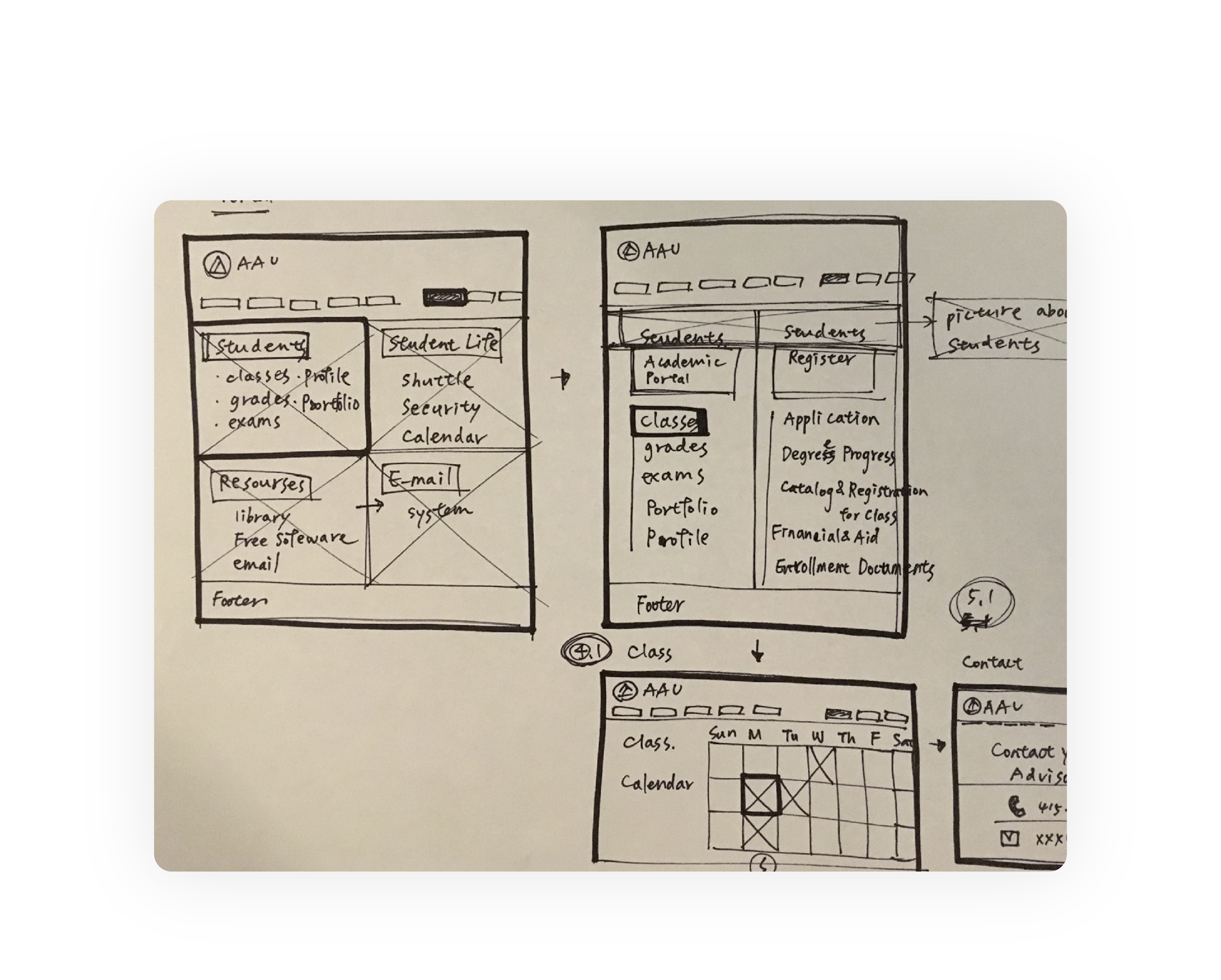
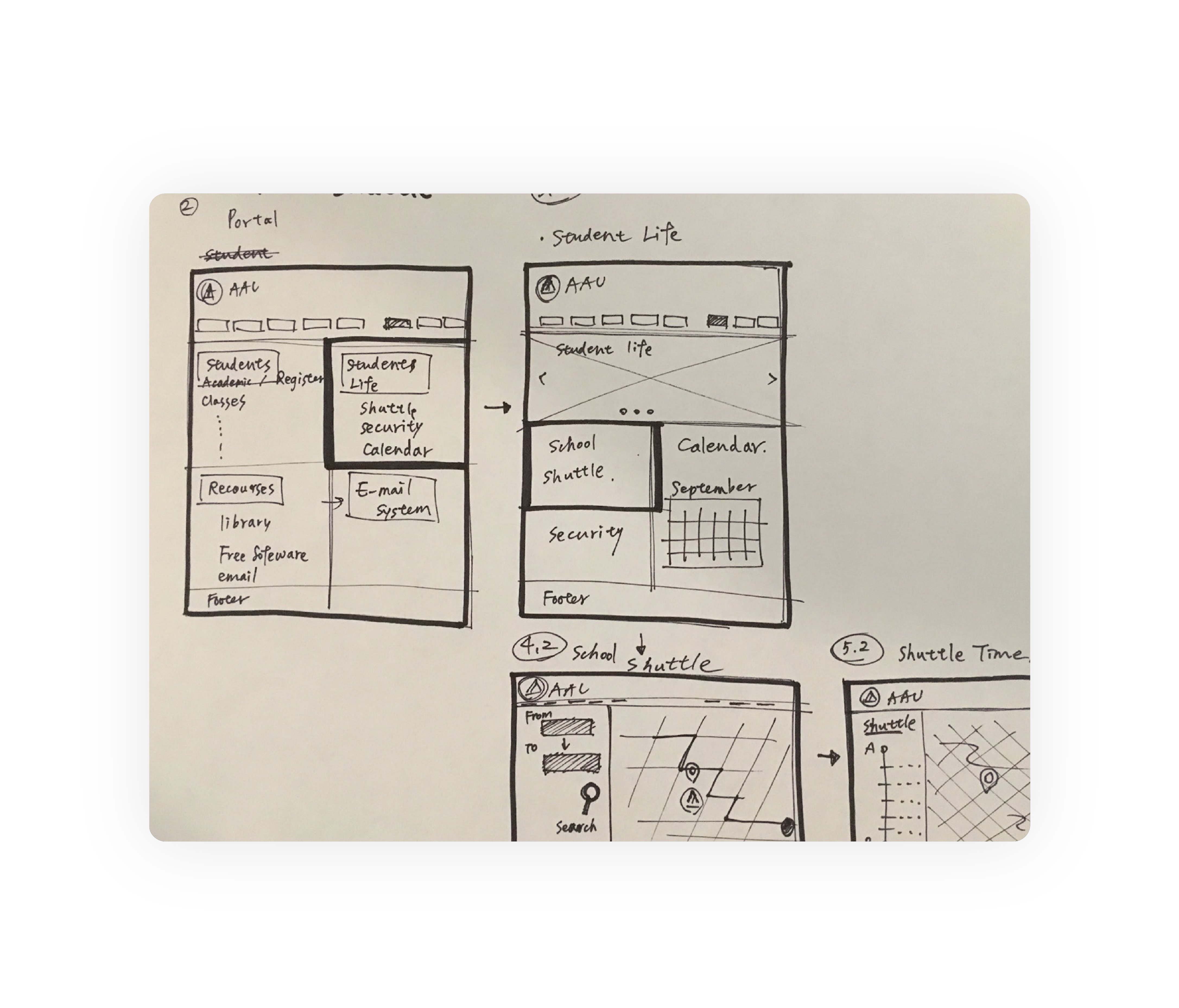
The wireframe is based on the research process, finding the purpose, the personas, the school’s brand color, and the structure. I used a visual hierarchy to lay stress on key information, and lead users. to easily find what they are looking for.

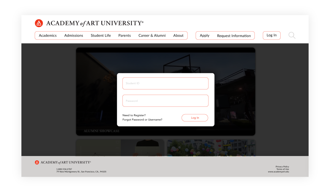
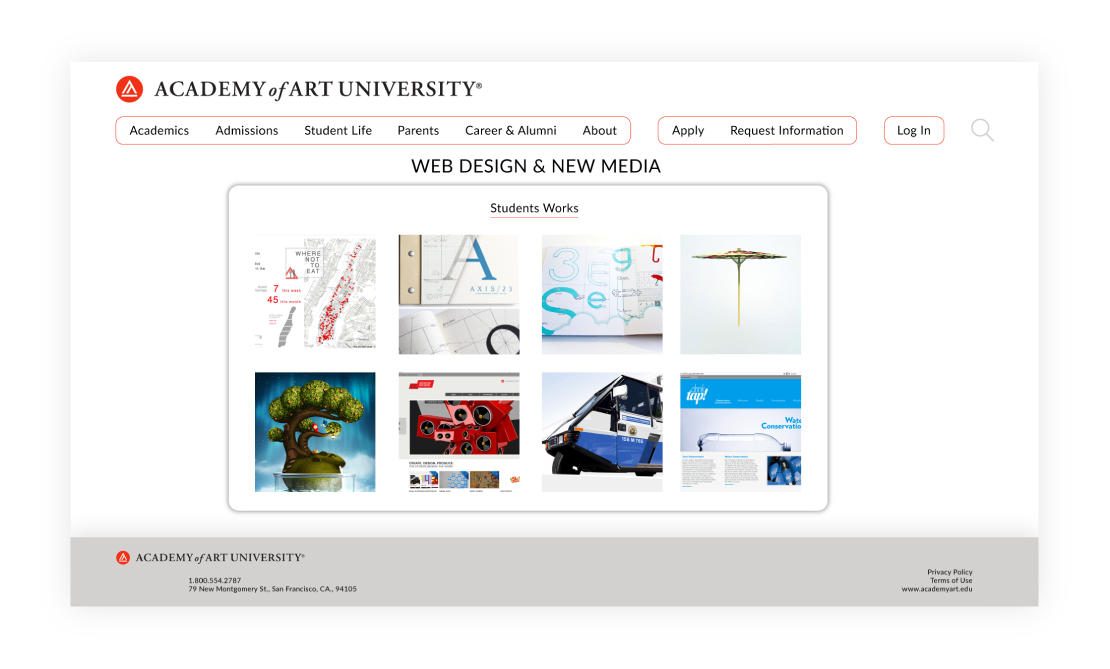
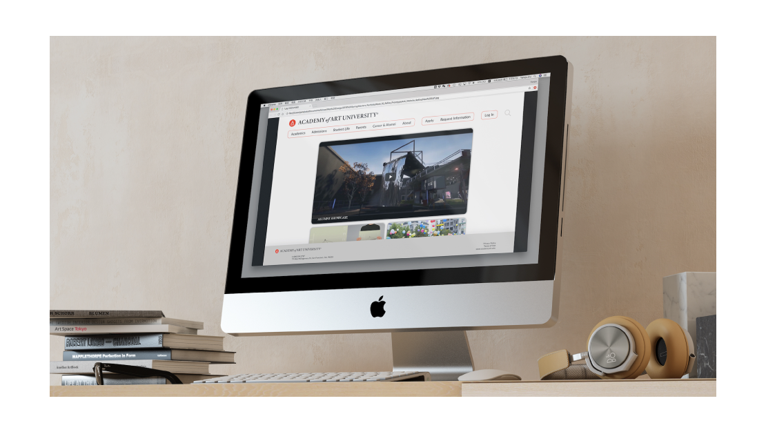
This website is a well-structured medium to send information to the audience. The interface design is based on previous research, for example, the purpose, personas, school’s brand color, structure and wireframes. Therefore, the users can make use of a clear and straightforward website.
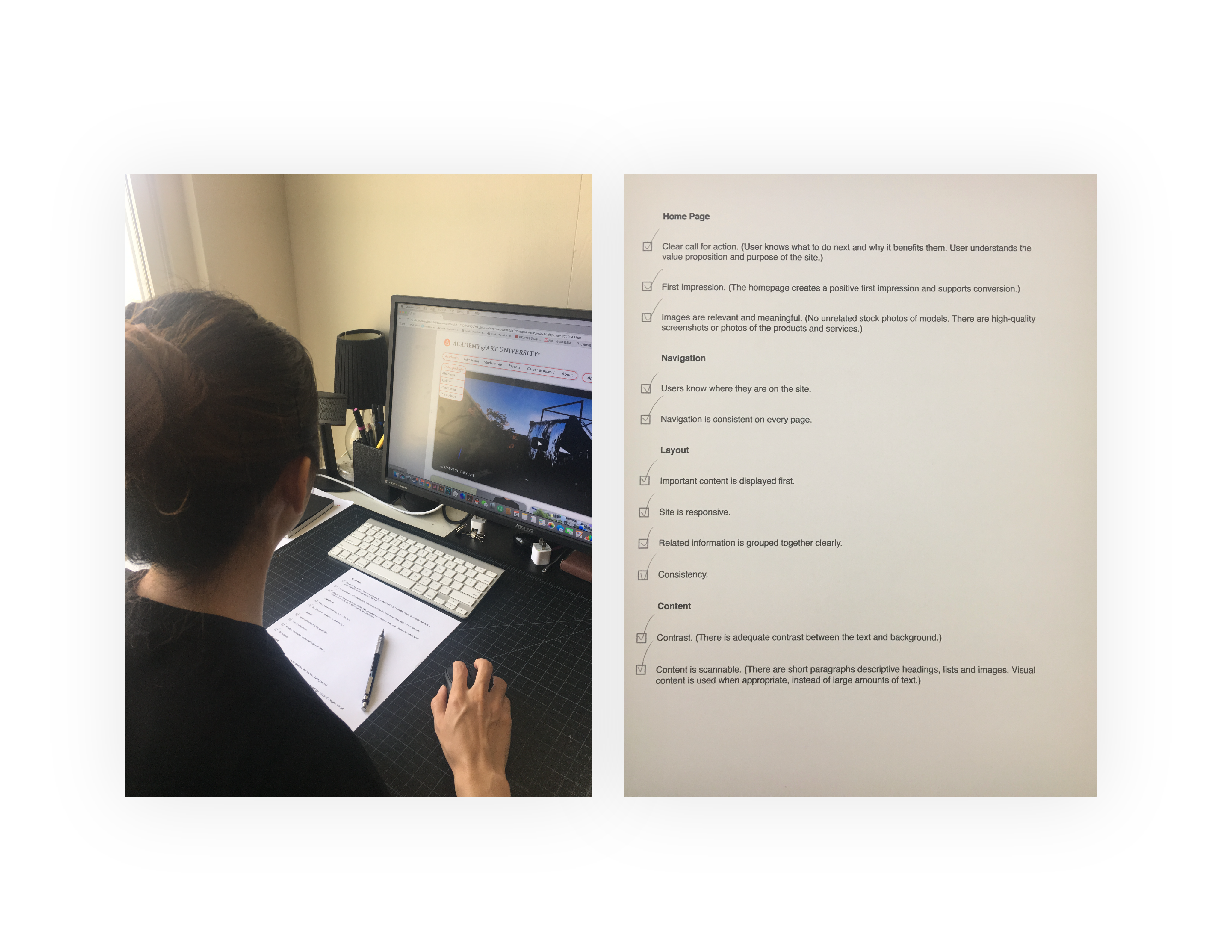
User testing is an important way to improve the users’ experience, so that the user can use the checklist to test the website and make sure the structure is logical and functional.
The navigation feels too heavy.
The whole visual also feels heavy.
The font size is too big.
Prefer the visual elements are cleaner.